GTU Website Redesign
- Accessibility
- Performance
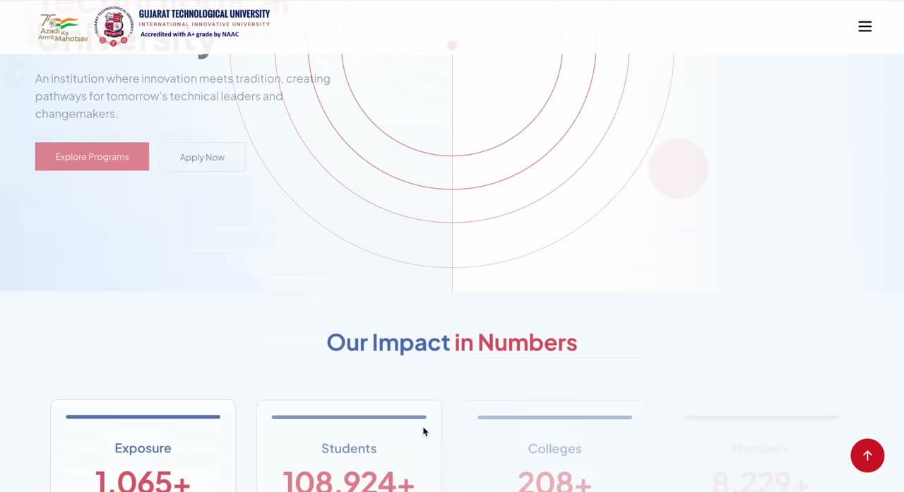
A responsive web portal for GTU built in Next.js, with accessible UI components and heavy performance work.
Who it was built for
Built for
GTU
A public technical university. Its website is the front door for applicants, enrolled students and affiliated colleges, and for most of them it is the only contact they will have.
The brief
Tens of thousands of students read this portal on mid-range phones and patchy connections, often to find one notice under deadline. It had to be fast and legible in those conditions, not on a designer's laptop.
What we delivered
Components that meet accessibility requirements
Performance treated as the feature
A design system, not a redesign
What it changes for the university
Fewer questions reach the desk
It works on the phone people own
The next page looks right by default
The business analysis
A public university's website has no revenue line, which makes it easy to under-invest in and expensive to get wrong. The analysis worth doing here is not commercial but operational: the portal is the front door for applicants, enrolled students and affiliated colleges, and every student who cannot find a notice on it becomes a phone call, an email or a person in a queue. That is the cost this project was against, and it is real money even though nobody invoices it.
- The conformance level GIGW sets
- WCAG 2.0 AA
Source · Guidelines for Indian Government Websites and apps (GIGW)
Accessibility here is compliance, not conscience
Most organisations treat accessibility as an ethical preference they will get to. For an Indian public institution it is codified: the Guidelines for Indian Government Websites and apps require conformance with W3C's Web Content Accessibility Guidelines 2.0 at level AA 1, framed around what the guidelines themselves call the trilogy of usability, user-centricity and universal accessibility 2.
The WebAIM Million shows how rarely that is achieved anywhere. Across the top one million home pages, 94.8% had detectable WCAG 2 A or AA failures, averaging 51 distinct errors per page 3.
Detectable accessibility errors per home page
A 10.3% improvement, and still 51 errors on a median home page.
Source · The WebAIM Million, 2025 report
The performance work is an inclusion argument
Globally, mobile accounted for 60.5% of web traffic in July 2025 4. For this audience the figure is higher and the hardware is worse: tens of thousands of students reading a portal on mid-range phones and patchy connections, often to find one notice under a deadline. Google's threshold for a good Largest Contentful Paint is 2.5 seconds, measured on the reader's own device 5 — which is the only place the measurement means anything.
| Optimising for | What it produces | Who it serves |
|---|---|---|
| A designer's laptop on office wifi | A portal that demos beautifully | Nobody in the audience |
| A mid-range phone on mobile data | Slower to build, and usable under deadline | The students who most depend on the portal |
| A screen reader and keyboard | Structural work with no visual payoff | A minority whose alternative is the front desk |
Where the value of this rebuild sits for the institution
- Every student who locates a notice themselves is one who does not contact the university about it.
- A portal usable only on fast connections quietly excludes the students who most depend on it.
- The next page looks right, and stays compliant, without anyone being briefed.
Model · Our weighting of the three delivered capabilities against the institution's service objectives.
One student, one notice, under deadline
The whole portal can be judged against a single task, and that task is not exploratory browsing. It is a student with a deadline looking for one document, on a phone, possibly on a train.
The task the portal is actually used for
Arrives from search, on a phone
First contentful paint on a slow connection
- ↳ Slow network → content before decoration, or the visit is abandoned
Is the notice findable?decision
- ↳ Not found → phone call, email, or a queue at the desk
- ↳ Screen reader user → semantic structure decides whether it is reachable at all
Read or downloaded
No contact generated
The design system is the governance mechanism
Publishing type scale, colour roles and spacing as tokens looks like a documentation exercise. In an institution it is the only way a standard survives staff turnover. The tokens on this page are the deliverable: a department that inherits them inherits the decisions, including the contrast ratios that make the palette compliant.
How the standard is enforced structurally
Tokens
- Heritage Blue
- Trust Blue
- Type scale
- Spacing scale
Accessible components
- Semantic markup
- Keyboard operation
- Contrast compliance
Page composition
- Next.js
- TypeScript
- Tailwind CSS
Delivery
- Image optimisation
- Framer Motion, used sparingly
What we would watch
| Risk | Why it bites | Early indicator |
|---|---|---|
| Departmental drift | Many teams publish into one portal. Tokens hold the standard only while people use the component set rather than working around it | Pages appearing with inline styles or colours outside the token set |
| Content weight creeping back | Performance gains on a portal are usually lost to added content, not to code — a carousel here, a PDF there | LCP regressions traceable to content additions rather than to releases |
| Compliance without usability | Passing an automated WCAG check is not the same as being usable by a screen reader. Automated tools catch only part of the problem | Zero detected errors alongside continued support contacts from assistive-technology users |
References
- 1.Guidelines for Indian Government Websites and apps (GIGW) · Government of India
- 2.GIGW — scope and objective · Government of India
- 3.The WebAIM Million — annual accessibility analysis of the top 1,000,000 home pages · WebAIM, Utah State University
- 4.Desktop vs mobile global web traffic (StatCounter data) · Visual Capitalist
- 5.Largest Contentful Paint (LCP) · web.dev, Google
Reference
Recommended case studies
Want the version of this built for your business?
Fifteen minutes with the people who shipped it. No deck, no account manager.